
Marketing automation tools like Marketo & Pardot aren’t the best when it comes to building flexible templates. Even if you are a developer, there isn’t a scalable & sustainable way to build a template that can produce a variety of layouts.
Having said that, when it comes to flexibility, Marketo, in my opinion, offers an interesting approach with variables. This isn’t an is Pardot better than Marketo article, but when it comes to flexibility, Marketo wins, in my book.
The magic combination is Marketo Guided templates and LESS or SASS to write your CSS. Even if you don’t use a CSS preprocessor, you could write plain CSS. Preprocessors just make your life easier.
This is a lengthy read so I broke it up into three parts.
Part 1: The big picture and setting up variables
Part 2: Implementing the variables in your landing page
Part 3: Part 3 is where you get to download free Marketo landing page templates.
Part 3: The CSS and HTML. I might even have a downloadable package.
What is a Guided Marketo Template?
A Guided Marketo Template is a template that allows users to build landing pages within boundaries the template establishes. Unlike a free-form template; which is open to custom design on the fly. Guided Marketo templates provide flexibility but with a more streamlined consistent approach. It uses something called template variables.
Part 1: The big picture and setting up variables
1. Plan
Even before you begin to design and code, think about basic layouts. Then think about 3 months from now, you are tired of the same old and want to play around with simple variations. What content will remain constant over all templates (logo, copyright etc) and what could potentially change. Below is an example of a simple template but with some flexibility, can produce quite a few different looking landing pages.
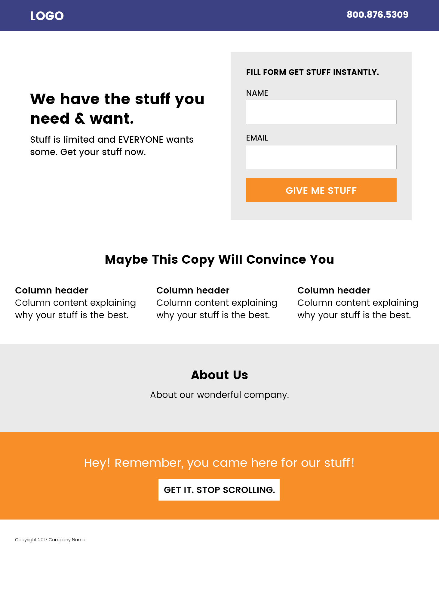
Let’s break it down. In this example we’re looking at a template that should allow landing pages with various types of hero sections.
Navbar at the top with a background
One option is the standard, Bootstrap-inspired navigation at the top with a logo and a phone number. Below which you want a hero section with intro copy and then the form itself.
1. Nav bar should be coloured (this means, the logo and any copy should be white)
2. The hero should be white – meaning, content should be black (or dark)
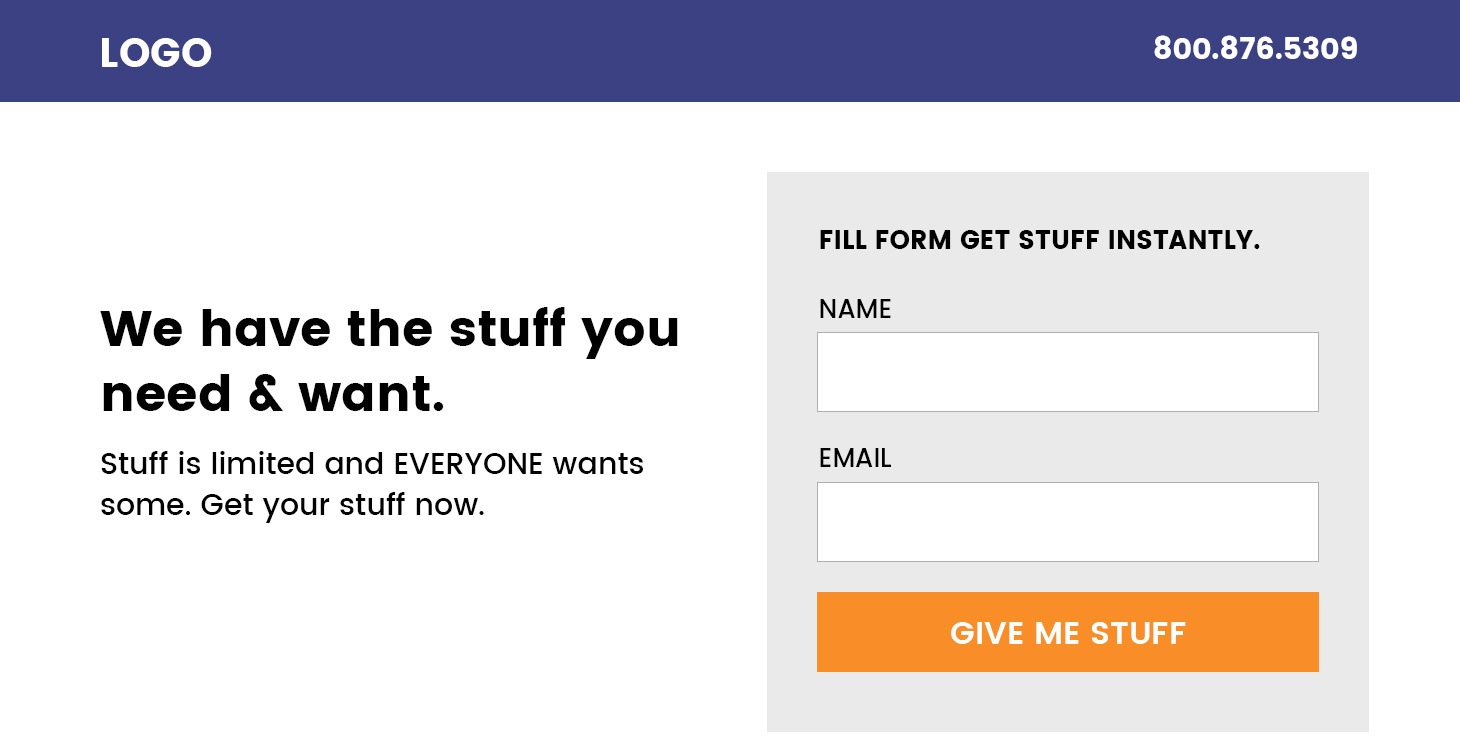
Variation 2 – The Bootstrap Jumbo.
Another option is to colour the hero the same as the navigation bar. This means, you now have to account for changing the colour of the content in the hero and adjust contrast (dark on light or vice versa).

Variation 3: Jumbo with a Twist
Just to mix it up a bit, we could pull the form out of the hero a little bit. Now if you were to build three landing pages and use three of these options, they would look different and not like they were all cloned with just copy being changed.
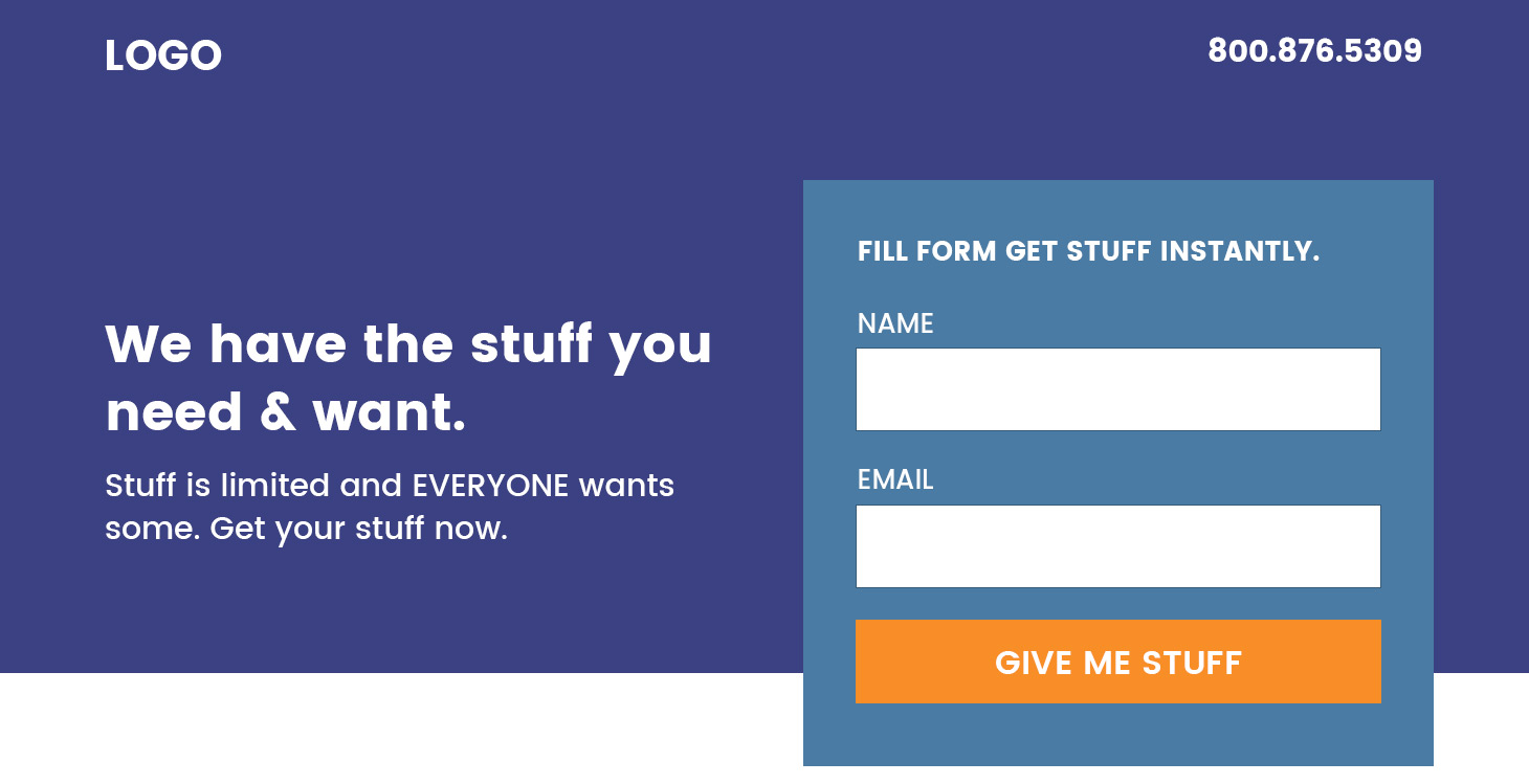
Also, you would want to change the colour of the hero on some landing pages. Now that we know what we are shooting for, we can begin building out the Guided Template.
Miscellaneous
We also have an “About Us” section that’s optional. The content in the About section will not change from landing page to landing page. All it needs is the user to choose whether to show it or not.
Now that we have the basic outline of what our template should look like and how it should work, we can begin building it out in Marketo.
2. Building the Guided Template
Now, I assume you know your way around this, even if you don’t, it isn’t complicated. Marketo Guided templates offer this beautiful thing called variables.
Think of variables as providing a bunch of switches that landing page creator can turn on or off to customise the layout.
Here’s all the variables that we will use in this example – declare them in the HEAD of the template. I’ll talk about all of them below
<head>
<meta class="mktoString" mktoName="Page Title" id="page-title" default="Page title">
<meta class="mktoString" mktoName="Page Description" id="page-description" default="Page Description">
<meta class="mktoString" mktoName="Hero Position" id="hero-position" default="flush">
<meta class="mktoString" mktoName="Hero Theme" id="hero-theme" default="dark">
<meta class="mktoString" mktoName="Hero Background" id="hero-bg" default="">
<meta class="mktoString" mktoName="Hero Background Color" id="hero-bg-color" default="">
<meta class="mktoString" mktoName="Form Position" id="form-position" default="normal">
<meta class="mktoString" mktoName="Logo Color" id="logo-color" default="white">
<meta class="mktoString" mktoName="Form Input Size" id="form-input-size" default="large">
<meta class="mktoBoolean" id="show-about" mktoname="Show About Section" default="true" true_value="block" false_value="none" false_value_name="Hide" true_value_name="Show">
</head>
A simple variable that will act as a placeholder for text or numbers looks like this:
<meta class="mktoString" mktoName="Descriptive Name" id="Unique-ID" default="Default Value">- mktoString defines the type of variable
- mktoName Give it a readable for your landing page creator to understand what it does
- id give it a unique ID
- Default Populate the page with a default value
Great. So we have 7 variables. Here’s what they do.
Page title and description variables could be there by default, if not, add them in. Your landing page creator will be able to replace the default content with what is relevant for that landing page.
The next 3 variables are for the hero.
- Hero Position will allow the user to force the hero below the nav bar or make it flush to the top of the page behind the nav bar. This is ideal if you want the hero to have a background. It will then sit fush to the top of the page. The nav bar would be transparent and rely on the hero as the background. See option two image above.
- Hero Theme lets the user set the theme – whether it is a dark background or light background – because the text and content has to adapt accordingly.
- Hero Background allows a user to paste a URL to an image that will be used as a background image
- Hero Background Color if you don’t want a background image and would rather use a background colour.
The last four variables
- Form Position is for option 3 where the form extrusion outside of the hero
- Logo Color Most logos are either single colour or full brand colour. Depending on your hero style and background, you’d want to allow which version of the logo to use.
- Form Input Size allows the user to choose the size of the form inputs. Large or regular
- Show About Section allows the user to show or hide a section, in this case it is the “About Us” section.
Finally, the colour of the logo. Remember, if the hero is flush to the top of the page and you choose the background to be a dark colour, the logo should be white. If the hero colour is white AND flush, the logo could potentially then use the original brand colours.